Color affects our emotional, mental, physical state, mood, performance, even decision. Our reaction/ connection to a certain color can be influenced by how it makes us feel, a memory, what it represents in our culture, what it symbolizes for us.
Newton and the rainbow
In 1666 Sir Isaac Newton found that as a beam of light passed through a triangular prism, it generated 7-colored rays of light. Red-orange-yellow-green-blue-indigo-violet.
Water droplets in the sky act as prisms: rainbows are formed like this.
Photo Credit: Alexas_Photos, Pixabay
The science of colors
“Color is emptiness, emptiness is color.” /Buddhist phrase/
Color is light broken down into electro-magnetic vibrations of different wavelengths. (The longest one is red.)
The color that we see is the color of light NOT absorbed by the object.
The surface of an object absorbs and reflects a color depending on its physical and chemical composition.
The quality and quantity of light (natural or artificial) can significantly modify how color appears. Too little light can be relaxing, but also dull when it comes to color. Enough light stimulates, while too much of it can wipe out colors.
The 3 dimensions of color can be measured:
- hue is the color name,
- value is the lightness or darkness of the hue,
- intensity is the degree of the saturation of the color.
The effects of colors
The impacts are physiological (causing change in the body) and psychological (sensed in the mind).
In an interior, more than any other design element, color sets the mood.
Studies have proved that color affects:
- how we feel about the space – warm and dark colors enclose the space, cool and light ones expand it
- how we perceive weight and size – dark colors are perceived heavier
- how we perceive temperature – warm colors can raise body temperature, cool ones can lower it
- the nervous system – certain colors soothe, others agitate
- the way how we react to sounds, tastes, smells
Here are the psychological associations of some colors:
Red: power, courage, strength, love, passion, anger
It is stimulating, so needs to be applied with care.
Orange: optimism, enthusiasm, rejuvenation, confidence, vitality
Due to the association with the fruit, it is a transition between warm and cool.
Yellow: brightness, playfulness, cheerfulness, hope, communication, illumination
Gold is a touch of luxury when it comes to accents.
Green: growth, rebirth, freshness, harmony, security, healing
Nature’s main color, it is the freshest of all.
Blue: calmness, reliability, sincerity, security, stability, creativity
More than other colors, it is affected by the material it covers.
Purple: power, dignity, luxury, grace, mysticism, independence
Best used on small surfaces, so it does not get too dramatic.
Black: sophistication, sorrow, mystery, magic
In small amounts, it helps other colors look crisper.
White: freshness, purity, cleanliness, sophistication, sterility
It makes other colors look cleaner.
Brown: stability, security, support, earth, warmth, comfort
The wide variety of its tones makes it a go-to color, especially when we pick furniture made of wood.
Colors in the interior – you, the wheel, and a scheme
What colors attract you? What colors do you like to wear?
When getting colors for an interior, pick your starting color and build your scheme around it.
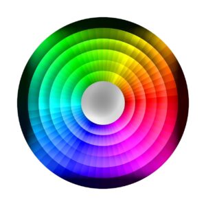
Image Credit: TheDigitalArtist, Pixabay
Red, blue, and yellow are considered primary colors because they cannot be made from other colors. On the color wheel, the primary colors are the starting point, because they cannot be made from other colors. (Combined they give black.)
In between the primary colors are the secondary colors:
- green (yellow + blue)
- orange (yellow + red)
- purple (blue + red)
In between the primary and secondary colors are the tertiary colors:
- red – orange
- yellow – orange
- yellow – green
- blue – green
- blue – purple
- red – purple
The color wheel is a super practical tool when choosing paint and furnishings. You can see right away how certain colors relate to each other.
Stick with the 60-30-10 rule: 60% of the main color, 30% of the secondary, 10% of the accent color.
What mood do you want to envelop when you are at home enjoying your nest? A bright spring day? Rich elegance? Relaxed retro? Classic chic?
The following schemes may help you.
You can create harmonious schemes by using colors that are next to each other on the wheel.
When the colors you choose are opposite each other on the wheel, you get complementary schemes. (A small amount can look amazing, as it brings vibrancy to a room.)
Instead of the color that is opposite, you can pick the one on either side of it. This way you will have split complementary schemes.
Selecting tones of one color will result in monochromatic schemes. Multiple tones and textures will show exciting variety.
Cool schemes of purple, blue-purple, blue, blue-green, green create a spacious feeling, as visually, cool colors recede. A small room appears larger if you paint it in a lighter tone of cool color.
Warm schemes of red, red-orange, orange, yellow-orange, yellow bring a cozier vibe, as warm colors advance. A larger room looks smaller if you paint it in warm colors.

Photo Credit: jessebridgewater, Pixabay
Neutral colors – black, white, gray, brown, beige, taupe, cream – are not on the color wheel. They bring serenity to the interior, and provide an excellent backdrop helping other colors pop. Turning to neutral and natural colors have been a top interior design trend for the past couple of years. These colors are crucial part of bringing nature indoors and supporting us in breaking away from the visual overload we experience in the outside man-made world.

Photo Credit: 829264, Pixabay
Accent colors are fun when it comes to spicing up your abode, bringing zest to neutral, monochromatic, and harmonious color schemes. Just don’t overdo it. Use them on smaller surfaces, like décor objects, pillows, throws, small rugs, artwork, and in form of fresh flowers.
Vibrant colors emanate so much vitality, you need to consider carefully how to use them.
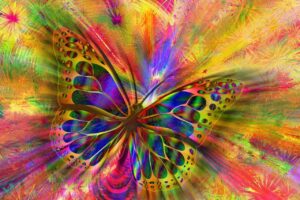
Image Credit: geralt, Pixabay
Make sure your color story – especially in rooms that are connected – creates flow between areas. Stay away from making the place too busy with lots and lots of colors and patterns. You do not want to feel restless and confused.
Personal colors
By our personal coloring we can be grouped into one these 4 seasonal color types: winter, spring, summer, fall. (A theory developed by Johannes Itten, from the Bauhaus School of Art, Germany.)
- Winter:
hair: dark-brown, black, silvery-gray
eyes: dark and clear white iris
skin: olive, dark-toned, blue/ blue-pink undertones
- Spring:
hair: golden blond, golden brown, gray with yellow tone
eye: blue, green, blue-gray, hazel
skin: ivory, peachy pink, creamy, golden beige
- Summer:
hair: golden brown, mousy, white
eyes: pale blue, gray, gray-blue, gray-brown, hazel
skin: translucent pink, rose/pale beige
- Fall:
hair: strawberry blond to red, auburn to copper
eyes: green, green-brown, hazel
skin: ivory, golden, tan
The colors that we most often like to wear reveal a lot about us.
Are you?
- energetic, courageous extroverted – red
- action-oriented, practical, competitive – orange
- stimulated, delving into what is going on, communicative – yellow
- a lover of quiet life, observing, cautious – green
- self-reliant, with deep feelings, in need of tranquility – dark blue
- super intuitive, with high aspirations – purple
- down-to-earth, loving all the best life has to offer, needing to be secure and accepted – brown
- optimistic, individualistic, trusting in that all things are possible – white
- disciplined, opinionated, independent – black
Photo Credit: StockSnap, Pixabay
Building a wardrobe based upon your color type is empowering, your personality can shine authentically, and you can feel supported in life. Picking colors whose psychology harmonizes with your temperament and personal wants fortifies the balance of your physical, mental, and emotional health.
Colors on your plate
Food is crucial when it comes to taking color vibrations into your body. Fresh natural foods in the yellow, orange, green, golden-brown, red, and blue color ranges can balance and heal. Choose food of a color to invigorate that color’s energy in the body. Eating foods with certain color frequencies supports the flow of life force energy in the body, it can cure disease, help boost immunity, maintain your health and beauty.
Yellow foods lift our spirits, empower us, boost mental activities.
Orange foods stimulate appetite and digestion, even protect against UV-radiation.
Green foods detoxify, refresh, and balance the body, make it more alkaline.
Red foods are energizing, some of them improve the immune system. (But too much red meat, eggs, and stimulants, like coffee, tea – also at the red end of the spectrum – can make one irritated, angry, impatient.)
Blue and indigo foods are cooling and calming the mind. Not only certain berries, but seaweed and some white-fleshed fish belong here also.
Traditional Chinese Medicine expands yin-yang theory to food (the plant and the animal kingdom) as well. Red foods are most yang, blue foods are most yin.
The chakras: 7 color vibrations
There are 7 main energy centers, chakras in the body along the spine. (Although the system goes beyond the 7, and beyond the physical body.) These centers take in light and resonate with their specific color vibration (the colors of the rainbow), connect to glands, organs, systems of the body.
CHAKRA – COLOR – GLAND – ORGAN – SYSTEM
Base chakra – red – adrenals – kidneys – muscular system, arterial blood
Sacral chakra – orange – reproductive organs – ovaries/testes, stomach, colon – reproductive system
Solar plexus – yellow – pancreas – liver, gall bladder, spleen – digestive system, nervous system
Heart chakra – green – thymus -heart, lower lung – circulatory system, parasympathetic nervous system
Throat chakra – blue – thyroid – throat, upper lung – respiratory system
Third eye – indigo – pituitary – eye, nose, ears – skeleton, venous blood
Crown chakra – violet – pineal – brain – central nervous system

Image Credit: Angela_Yuriko_Smith, Pixabay
Imbalance somewhere in the system upsets the harmony of the whole. There are several ways to free the energy flow of a blocked chakra:
- certain yoga poses
- visualizing the color of a certain chakra
- chakra balancing meditation
- music, sound healing, chanting the sound of a chakra
- breathing in the color
- gemstones, crystals
- aromatherapy
- affirmations (written down for extra punch)
- eating that color food
- wearing that color outfit
- surrounding yourself with the color
- directing color energy with the hands
- color therapy
Color therapy
By affecting the subconscious, so dealing with the imbalances at the core, color therapy releases blockages, and brings balance back to the body, so it can heal.
There are numerous holistic ways of harmonizing color energies in the body.
A version of color therapy is wearing clothes/ placing a scarf on a part of the body/ lying on a sheet of a chosen color. (For example: turquoise = blue and green mixed, for relaxing and rejuvenating the stressed mind.)
Soaking in a color bath (warm, not hot!) is another beneficial way. (For example: green for relaxing and balancing the muscles, the mind, the nerves, and for getting a feeling of harmony and self-control.) Essential oils add extra benefits, as they have their related color wavelength, holding life energy from the sunlight.
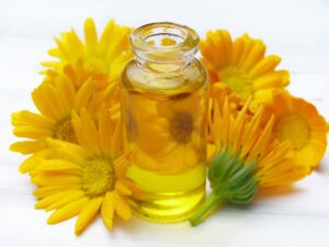
Photo Credit: silviarita, Pixabay
Drinking solar-energized water can be therapeutical as well. Leave water in a colored bottle in the sun, so it can take in both the energy of the color and the sun.
(For example: indigo for headaches, sore throat, sunburn.)
Bach flower remedies treat emotional problems that could lead to illness. In the 1930’s Edward Bach (doctor, homeopath) placed all emotional problems in 7 groups and developed 38 remedies to heal all the negative aspects of these. Flower essences carry light vibrations from the sun. The color, scent and shape of the flower together deliver a vibration that can be captured in water. The essence born this way holds the flower’s healing frequency.
Just bringing home a bouquet of fresh flowers (you can consciously pick colors) is therapeutical, raises the vibration of your place and lifts your spirits.
From a Feng Shui point of view
“Tao and the universe is empty- and yet it is full.” /Professor Lin Yun/
Universal energy (chi) is everywhere, circulating in the human body as well. Colors can balance our energy, advance our life. Chi shows up as 5 elements: wood, fire, earth, metal, water. There are specific colors, directions, seasons, organs associated with each element in The Five Elements Theory. The color associations are wood – green, fire – red, earth – yellow, metal – white, water – black.

Image Credit: stux, Pixabay
The Bagua is a map of 9 areas of life with corresponding elements. We can superimpose this octagon onto any space. Displaying the right element colors in the right areas and being aware of the creative and destructive cycles of the elements, will bring balance.
Colors in landscaping
Healthy, lush, green vegetation is the sign of good chi on the land. We can intentionally choose plants by their symbolism, color, and leaf-shape to improve the energy of the lot, and the fortune of its inhabitants. (For example: evergreens symbolize longevity.)
By laying the Bagua on the plot and choosing plant colors accordingly, we can enhance specific life areas of the occupants. Plants can also correct bad energy. (So shrubs can serve as natural buffers against unpleasant noise or unwanted view.) Inauspicious plot shapes can be corrected by planting flowers in strategic ways taking the Bagua into consideration.
Exterior colors
The colors of the house, the façade, the window frames, the doors; the outbuildings; the outdoor furniture; the flowers and plants chosen carefully will promote harmony and prosperity.
For businesses, workplaces, stores, schools the best choices are colors of life force. They are stimulating. While an artist’s studio or a computer software company can benefit from black as the exterior color; a grocery store’s exterior should be light green, light blue or yellow; a toy store multicolored.
Here is an example how to use the Creative Cycle of the 5 elements on the exterior from bottom to top (Destructive Cycle from top to bottom):
driveway – bottom trim – walls – shutters – roof
driveway – brown – earth
bottom trim – white – metal
walls – gray – water
shutters – green – wood
roof – red – fire
Interior colors
The vertical sequence of the 5 element colors can be used anywhere to better the energy flow. An example how to utilize the Creative Cycle in the interior from floor to ceiling:
floor – furniture – walls – curtains – ceiling
floor – brown – earth
furniture – white – metal
walls – gray – water
curtains – green – wood
ceiling – red – fire
Applying the 5 Element Colors, the 6 True Colors (white, red, yellow, green, blue, black), the 7 Rainbow Colors consciously to your place, your body, your food, your impressions will bring you in alignment with universal energy flow and ensure healing, harmony, joy, creativity, and abundance in every area of your life.
Photo Credit for Featured Image: ivanovgood, Pixabay
Julianna Kocsis is a Feng Shui Specialist, Organizational Expert, Intuitive Vibrational Catalyst, Textile Design Archivist. She is also the founder of Talila Consulting. Bringing Order and Harmony to your Home, Work and Life.
To book an appointment, contact Us: talilaconsulting.com/contact